• Home
  • The Work
    • Studio Paintings
    • Figure Drawings
    • Plein Air Paintings
  • Contact
  • Blog
  • The Lena Series
George Rhys Artist

Consulting the Color Stars

6/23/2017

0 Comments

 
Picture
Other color harmonies suggested by Ostwald’s color system hold the hue constant and vary the white or black content or both.  Before I describe these, though, I would like to take the reader aside for a disclaimer:

My intention is not to teach this stuff academically (I am leaving a lot of that out) , nor even to advocate its use. I am presenting it because I have found it very helpful; it has rescued me from many jams where I knew a painting needed something regarding color but could not figure out what. BUT, if you like what you see so far, or like the idea of having a way to accurately analyze and solve a color problem, you will have to spend some time practicing.

You could make a bunch of color charts, maybe even make your own Ostwald-inspired color book, but as for me I am grateful that in my youth I was so taken by this system that I used it for my first two or three hundred paintings. I no longer mix my colors using just hue, black and white. In fact I practically never use black—not because of some silly impressionist’s phobia, but because I can get to my target color faster now that I know my way around. More on that in a future article.
Picture
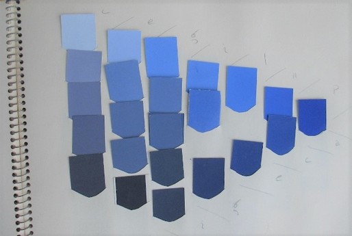
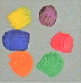
To begin, I have selected a blue page and pulled a series of colors from a diagonal that runs down and to the right. The colors to the upper left have an increasing ratio of white to hue.
Picture
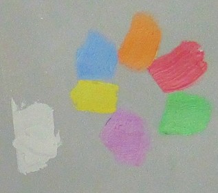
Here is that whites group. Can you identify from where each chip came on the full-page chart? (You really should make your own series. The computer, in its certainty that it knows what we want better than we do, has hopelessly brightened my blue shade. This is the second row down.)

This next group comes from a diagonal that runs upward to the right. Each color features the same ratio of hue to white; only the amount of black relative to hue changes. ​
Picture
Picture
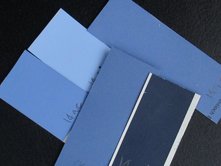
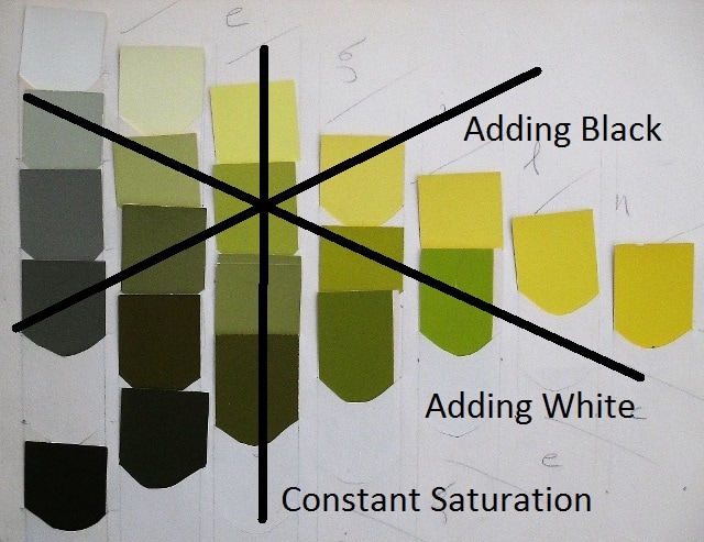
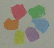
Finally, consider the colors taken from a vertical column. These colors all have the same saturation. In other words each color has the same ratio of hue to gray; the grays differ in their darkness.

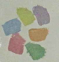
Take a moment to enjoy these groups. They are not aggressively harmonious, but try this: mix a series for yourself and then include a color from elsewhere on the page and see if it “fits.” I remember going to a show of William Baziotes at the Guggenheim and being horrified to see him place saturated colors among the muted. I was more dogmatic then, but the combinations were unsettling.

Picture
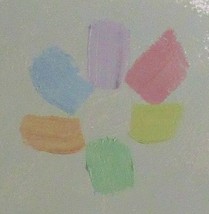
When a saturation series, a whites series and a blacks series are chosen to converge at a single color we have what is called a star, all of whose colors harmonize as a cluster. When colors are jarring and I don’t want them to be, I consult the stars. We can build a painting’s color scheme (or troubleshoot a bad one) on a framework of stars from different hues, making sure that the centers of the stars match up like the combinations I demonstrated in the previous post. 
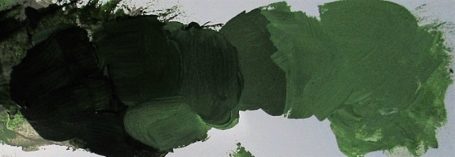
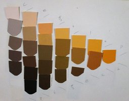
Below are three groups of harmonies made with chrome green. You can do this with any color, and it doesn’t have to be pure hue. In fact the pure hue doesn’t generate a star, as you can figure.
Picture
​Here a green shade is mixed with varying amounts of white.
Picture
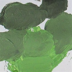
These greens started with a tint, to which was added black.
Picture
The vertical column of colors is accomplished by mixing a tint and a shade of equal saturation—to the best of my ability.

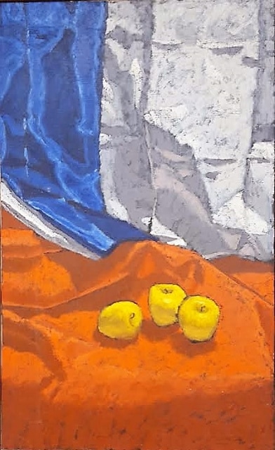
Now you try! Make a few still lifes using colors derived from hue, black and white, just to get the feel of it.
​
A final word in closing, to address the issue of value. You may have noticed that value is not one of the specified dimensions of this system, but you’ll also notice that value varies in every one of the harmony groups shown. Value may be the preeminent concern among many—or most—artists, but here are four ways to vary light and dark harmoniously, not randomly.

0 Comments

Color Harmonies, Variable Hues

6/5/2017

0 Comments

 
PictureThese are pure hues, but I was unable to avoid some glare, especially on the purple.
I received my first set of oils when I was eleven, so by the time I was studying Walter Koch’s binder of the Ostwald color system I had experienced mixing colors—but I had had no idea of how very little I knew. The book did not instruct the reader in mixing, but the notion that one could mix any color with a hue and black and white called to me to put it to work.

The book did have things to say about color harmonies, a subject of which I had never been directly aware. Now I discovered a thrill, a real thrill, when contemplating the simple combinations of colors suggested in Walter’s book.

These are pure hues, pretty much straight out of the tube. I hope they come across as if I had lifted them from a standard color wheel.

Below are more samples of harmonious combinations all of the same type. All the colors in each set have the same percentage of white and the same percentage of black mixed with a pure hue—as best I can approximate a book I haven’t seen in decades. These are not perfect but you get the general idea.

Picture
Do these excite you too? So fulfilling to incorporate this principle into painting!
I have used one premixed gray to blend with each of the hues, so that the only challenge now is to mix equal amounts (visually speaking) of this gray to each hue. Because my homemade book of colors is non-archival and over 40 years old, I’ve had to eyeball my mixes. I am seeking to match colors that would appear on the same location on each of the respective hue triangles. (See the previous blog post “Discovering Color.”) Try it for yourself! Be aware that different pigments behave differently in mixes; I will have to compensate.
PictureEach of these harmony groups begins with the same six hues above.
How did Ostwald manage all of this, without a book to work from? He made a wheel, and covered varying sizes of pie sections with hue, white and black—hence his percentages—and spun it.

There are a lot of technical issues I am leaving out of this account, such as the coordinates used to place a tonal color precisely. Without a ready-made reference, I don’t see how descriptions of these technicalities would help the reader; and though I sometimes use them myself, they are not absolutely necessary. For my friends who were hoping to get some suggestions about harmony, this account should at least give a direction for their own experiments.

One of the unexpected consequences of learning about tonal color harmonies was that I became much more sensitive. I had had trouble enjoying the work of Henri Matisse, and could not understand the hoopla about his color, which seemed to me muted, even washed out. 
Picture
Each set of six colors has its own percentage of white and black.
Picture
The percentage of hue is quite low here.
But now! What a knockout! I began using more and more subtle tonal combinations in my own painting because, well, I loved them. Bright colors are striking and appealing to many, I know, but I am a quiet person and relationships of colors excite me more than singletons.
 
 
Future color topics
  Hue Balance:  Simple and Complex
  Color Harmonies: Holding Hue Constant
  Two more dimensions: value and temperature; Munsell
  Navigating across the Quiller wheel, and through the color solid
  Chevreul, Itten et al.
  
Dyes and flakes
0 Comments

Practicing With Color

6/1/2017

0 Comments

 
At the beginning of my color studies it amazed me to think that any color I could see had a well-defined place in Ostwald’s color solid. Could it be true that every color had no more than three coordinates? No color could slip out of the double cone and defy the system? No two different colors could have the same address?

Eventually I had to accept this non-intuitive truth: a color’s triplet of coordinates would nail it down. (I know now that there are several such systems, but I still prefer Ostwald’s.) What that signified to me, then, was almost miraculous: Each color has just three ingredients. According to Ostwald these were hue, white and black.

(Note: 
Color—anything that comes in a giant box of crayons, and more: white, gray, brown, bright blue, black. If you can see it, it is a color.
Hue—a color on the standard color wheel, or on Playskool blocks (do they still make those?). If a crayon says red, or yellow, that’s a hue.)


Since I had trained myself to distinguish the hue of any color, I decided I would begin the pursuit of a color mix with its hue, acquired by combining the paint-tube hues nearest the desired hue on the color wheel. For example if I wanted to match a brown whose hue I had discerned was red-orange, I mixed red and orange to attain the hue I saw in the brown.
Picture
The Three Graces, Oil, 38 x 24", 1967
I knew to mix nearby hues, because two hues that were far apart on the wheel combined to an impure color. I first noticed this when I attempted to create an orange from red and yellow. No matter how careful I was, my orange never attained the purity of cadmium orange straight from the tube. I had been taught that red and yellow made orange and that was that. Perhaps study of the color chips had enhanced my perception, but more likely I had just never had occasion to notice that mixed orange was not quite brilliant.

I’ll have more to say about this phenomenon later. For now I’ll just relate that I had more success starting mixes with pure hues, rather than making green out of blue and yellow, or purple out of blue and red. And I used pure hues: permanent green rather than viridian or Hooker’s green. Then if necessary I corrected the hue of the green with blue or yellow.
​
Now, with a pure hue on my palette, I guesstimated how much black to add, and then how much white. You have to understand what a crucial difference this made for me. Instead of adding a little rose and a little ochre or green and spiraling out of control with a great expanding wad of goo on my palette, all I had to worry about were black and white. If I went hopelessly astray all I had to do was go back to the pure hue and start again.

In my work at Rowe, I had many opportunities to practice with colors. Our studio was in a little building on a hill above the plant. After choosing or matching a color I made a trip down the hill to the paint line or the silkscreen line, past great machines by which men cut and bent huge sheets of steel into shapes that other men then placed into large spot welders to make several attachments at once. The wrists of each worker were connected to his machine by cables, and every time the upper part of his machine came crashing down the cables yanked his hands out of the way. It was a loud place of pounding and sparks and the smell of oil and hot metal.

After approving or reconsidering the colors at the paint line I passed again among the shapers and assemblers to our quiet little studio. I found it very upsetting to think of those men tied to their behemoths all day.
I returned to Princeton, under some duress. While there and after graduation I painted a lot of still lifes. I took immense pleasure in holding my palette knife up before the color I was targeting and seeing a perfect match. And I learned a lot that way, too. Within shadows was the shift along the color wheel, as pointed out by the Impressionists. This meant that to mix the color of a shadow I had to begin afresh with the appropriate hue.
​
​I noticed that shadows are quite saturated, not accomplished by simply adding black. That practice will certainly deaden the color of the shadow, because it drastically reduces the percentage of hue. This is the deadening that teachers talk about, though they do not explain it. 
Picture
Leaves and Glass, Oil, 1975
Measured use of black for a color match doesn’t deaden it any more than any other method of mixing a color; mixing with hue, black and white and holding up the palette knife to check taught me to keep shadows saturated, and to respect any hue shift.
Picture
(Saturation—also called intensity or colorfulness—is, under this system, very simply the percentage of hue in a color. In the triangle of colors of a given hue, all the colors that are aligned vertically have the same saturation; some have more black, others more white. Colors to the right are more saturated. Toward the left, approaching the gray scale, colors are less intense.)

Today I almost never mix colors using only hue, black and white, but thanks to many years of careful practice I am quite familiar with the color solid and can bounce around in it and still keep my bearings, confidently mixing any color I want to. If I get lost I can always go back to Ostwald. I may change my mind about what color I want, but can find whichever one I choose.

​Next installment: Color Harmonies

0 Comments

    Verbiage

    Sometimes you just have to talk about ideas. Well, I do anyway.

    Archives

    August 2018
    January 2018
    December 2017
    August 2017
    July 2017
    June 2017
    May 2017
    December 2016
    October 2016
    September 2016
    July 2016
    June 2016
    May 2016
    March 2016
    February 2016
    January 2016

    Categories

    All

    RSS Feed

Proudly powered by Weebly