• Home
  • The Work
    • Studio Paintings
    • Figure Drawings
    • Plein Air Paintings
  • Contact
  • Blog
  • The Lena Series
George Rhys Artist

Practicing With Color

6/1/2017

0 Comments

 
At the beginning of my color studies it amazed me to think that any color I could see had a well-defined place in Ostwald’s color solid. Could it be true that every color had no more than three coordinates? No color could slip out of the double cone and defy the system? No two different colors could have the same address?

Eventually I had to accept this non-intuitive truth: a color’s triplet of coordinates would nail it down. (I know now that there are several such systems, but I still prefer Ostwald’s.) What that signified to me, then, was almost miraculous: Each color has just three ingredients. According to Ostwald these were hue, white and black.

(Note: 
Color—anything that comes in a giant box of crayons, and more: white, gray, brown, bright blue, black. If you can see it, it is a color.
Hue—a color on the standard color wheel, or on Playskool blocks (do they still make those?). If a crayon says red, or yellow, that’s a hue.)


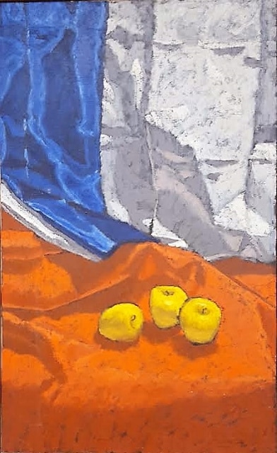
Since I had trained myself to distinguish the hue of any color, I decided I would begin the pursuit of a color mix with its hue, acquired by combining the paint-tube hues nearest the desired hue on the color wheel. For example if I wanted to match a brown whose hue I had discerned was red-orange, I mixed red and orange to attain the hue I saw in the brown.
Picture
The Three Graces, Oil, 38 x 24", 1967
I knew to mix nearby hues, because two hues that were far apart on the wheel combined to an impure color. I first noticed this when I attempted to create an orange from red and yellow. No matter how careful I was, my orange never attained the purity of cadmium orange straight from the tube. I had been taught that red and yellow made orange and that was that. Perhaps study of the color chips had enhanced my perception, but more likely I had just never had occasion to notice that mixed orange was not quite brilliant.

I’ll have more to say about this phenomenon later. For now I’ll just relate that I had more success starting mixes with pure hues, rather than making green out of blue and yellow, or purple out of blue and red. And I used pure hues: permanent green rather than viridian or Hooker’s green. Then if necessary I corrected the hue of the green with blue or yellow.
​
Now, with a pure hue on my palette, I guesstimated how much black to add, and then how much white. You have to understand what a crucial difference this made for me. Instead of adding a little rose and a little ochre or green and spiraling out of control with a great expanding wad of goo on my palette, all I had to worry about were black and white. If I went hopelessly astray all I had to do was go back to the pure hue and start again.

In my work at Rowe, I had many opportunities to practice with colors. Our studio was in a little building on a hill above the plant. After choosing or matching a color I made a trip down the hill to the paint line or the silkscreen line, past great machines by which men cut and bent huge sheets of steel into shapes that other men then placed into large spot welders to make several attachments at once. The wrists of each worker were connected to his machine by cables, and every time the upper part of his machine came crashing down the cables yanked his hands out of the way. It was a loud place of pounding and sparks and the smell of oil and hot metal.

After approving or reconsidering the colors at the paint line I passed again among the shapers and assemblers to our quiet little studio. I found it very upsetting to think of those men tied to their behemoths all day.
I returned to Princeton, under some duress. While there and after graduation I painted a lot of still lifes. I took immense pleasure in holding my palette knife up before the color I was targeting and seeing a perfect match. And I learned a lot that way, too. Within shadows was the shift along the color wheel, as pointed out by the Impressionists. This meant that to mix the color of a shadow I had to begin afresh with the appropriate hue.
​
​I noticed that shadows are quite saturated, not accomplished by simply adding black. That practice will certainly deaden the color of the shadow, because it drastically reduces the percentage of hue. This is the deadening that teachers talk about, though they do not explain it. 
Picture
Leaves and Glass, Oil, 1975
Measured use of black for a color match doesn’t deaden it any more than any other method of mixing a color; mixing with hue, black and white and holding up the palette knife to check taught me to keep shadows saturated, and to respect any hue shift.
Picture
(Saturation—also called intensity or colorfulness—is, under this system, very simply the percentage of hue in a color. In the triangle of colors of a given hue, all the colors that are aligned vertically have the same saturation; some have more black, others more white. Colors to the right are more saturated. Toward the left, approaching the gray scale, colors are less intense.)

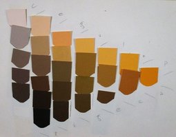
Today I almost never mix colors using only hue, black and white, but thanks to many years of careful practice I am quite familiar with the color solid and can bounce around in it and still keep my bearings, confidently mixing any color I want to. If I get lost I can always go back to Ostwald. I may change my mind about what color I want, but can find whichever one I choose.

​Next installment: Color Harmonies

0 Comments


Leave a Reply.

    Verbiage

    Sometimes you just have to talk about ideas. Well, I do anyway.

    Archives

    August 2018
    January 2018
    December 2017
    August 2017
    July 2017
    June 2017
    May 2017
    December 2016
    October 2016
    September 2016
    July 2016
    June 2016
    May 2016
    March 2016
    February 2016
    January 2016

    Categories

    All

    RSS Feed

Proudly powered by Weebly