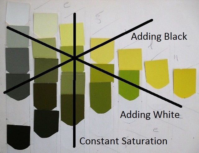
If you study Ostwald’s Color Primer you will find every fact I have reported here presented much more thoroughly. The only worthwhile additions my articles provide are the discoveries of an artist in the application of those facts, suggesting for example that the painter spend some time learning to mix colors with just hue, black and white, for the purpose of later mastery of any color-mixing method. I did that, and I recommend the practice for anyone who finds color challenging.
In the mid-seventies I saw an illustration in a magazine that featured outlines and two or three pure hues. I had been emulating Matisse for a while and that simple painting suggested my next step. I began painting large bold outlines in burnt umber darkened with black, then filling in the shapes with nearly pure hue. I was exploring.
In the mid-seventies I saw an illustration in a magazine that featured outlines and two or three pure hues. I had been emulating Matisse for a while and that simple painting suggested my next step. I began painting large bold outlines in burnt umber darkened with black, then filling in the shapes with nearly pure hue. I was exploring.
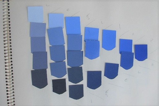
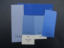
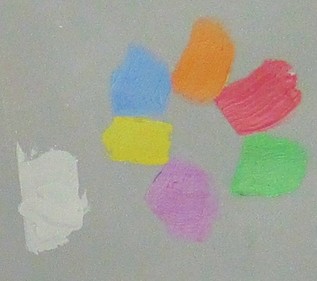
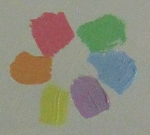
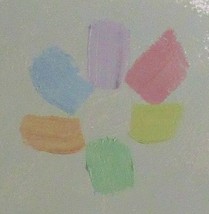
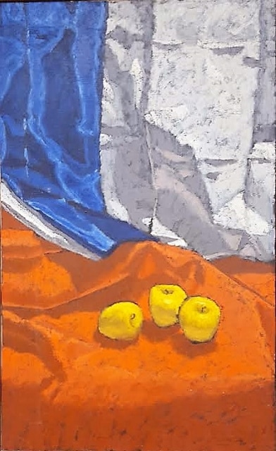
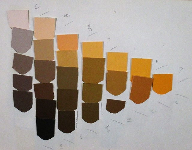
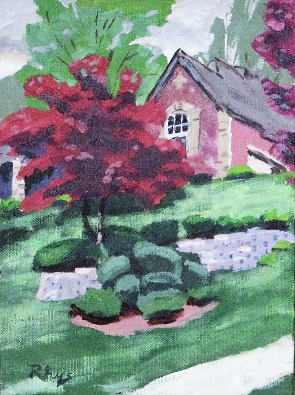
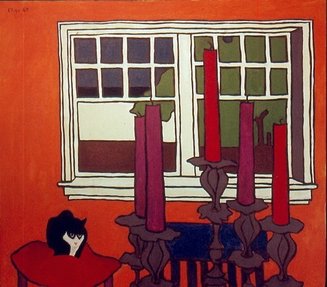 Little Blackie, oil | There are many discussions of how to break up the color wheel to achieve balance in a painting so I don’t need to belabor that here, but there is one important difference between Ostwald’s color wheel and everyone else’s. Ostwald stretches out the green arc to the point that green is treated like a fourth primary. The four “fundamental” colors are red, blue, yellow and sea green. Blue and yellow are complementaries, as are red and sea green. |
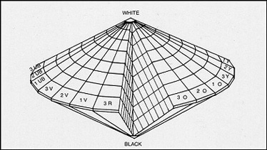
Why? I believe it is because Ostwald did his mixing by spinning.
| We all learn early in school that mixing blue and yellow gives green. But when blue and yellow are spun together, the result is gray, and since no clarification appears in the Primer, I offer one here. The pigment, or subtractive primaries are blue, red and yellow; or, more professionally, cyan, magenta and yellow. These behave as we were taught in school. The light, or addition primaries are red, green and blue. A pigment mixture of all three subtractive primaries in the appropriate ratio is a very dark gray. A mixture of light beams of all three light primaries is white. |  In Burnham Park, oil. This features a simple additive triad. |
When colors are mixed by spinning, the hue is determined by addition, but unlike a mixture of light beams a spun mixture is darkened by the fact that the color swatches are not light beams, but pigment, which is subtractive. I will deal with all this subtractive business in a future article.
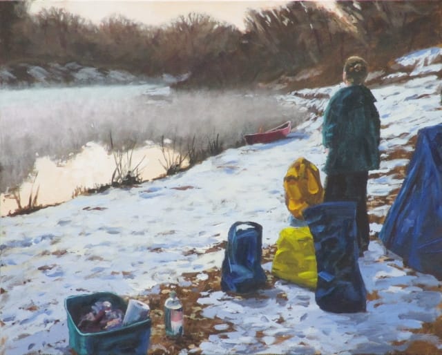
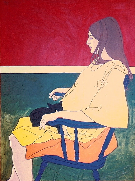 Waiting for Jesse, oil. (Back when it was an insult, a visitor to my gallery accused me of working from a photograph. Nope!) According to the theory, this is a very yellow painting! That horizontal stripe, though, was white. All I have is an aged slide. | The upshot is that, since red and green add to make yellow, an additive mixture of blue and yellow is actually a mixture of red, green and blue, with the potential of producing a neutral gray. Perhaps because of reluctance to demote yellow as a primary, Ostwald combines both sets of primaries, and winds up with four. It seems reasonable to consider an additive combination from Ostwald’s wheel for a painting’s color balance. A composition of red, blue and green might feel quite right, such as a red barn, green trees and blue sky. Of course that employs just the simplest triad. (See In Burnham Park above.) I am suggesting practice with divisions of Ostwald’s wheel for an experimental possibility. The Color Primer is a pretty good guide for building your own circle. The paintings I have presented in this post were, in fact, such experiments. |
I don’t know how many are keeping up with this series. I know it is pretty technical, but I also know that every subject in the world, studied to any depth, involves technical material. In a while I will show how even the Impressionists, those wild non-conformists, approached color from a surprisingly technical point of view—more even than most people think they know!
But first I am going to get even more technical about balance.
But first I am going to get even more technical about balance.


 RSS Feed